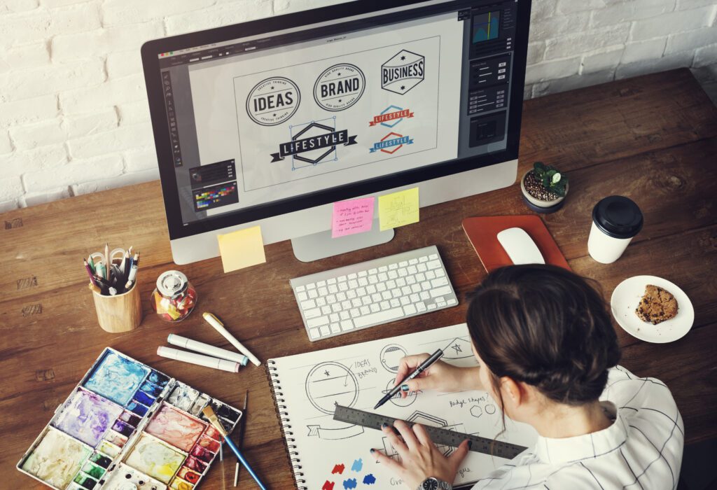
Are you hoping to start getting to work on designing your company’s logo, or are you trying to redesign your current one? Your logo is perhaps the most critical part of your branding, as it’s often the first impression potential customers will have with your company.
For this reason, crafting an original, professional, and appealing logo is a must. Keep reading to learn about some logo trends you should avoid and some tips on making sure your company logo is modern and practical.
1. Using Too Many Bright Colors
While you may think that creating a logo with tons of bright and exciting colors might catch viewers’ eyes, it can be uncomfortable for the eyes. Additionally, including too many bright colors in your logo design can cause a clashing appearance that, in turn, looks messy and unprofessional. It can also be overwhelming to the eye, making the text in your graphics less prominent and difficult to decipher.
Instead, you want to work to strike a balance between color and white space. Adding a bright color to your logo can work if balanced with some negative space to give the eye a break. Additionally, setting a bold color on a neutral, non-busy background can help make your logo pop.
2. Using Overused Logo Elements
When logo designs start trending, tons of businesses incorporate these trends into their branding. However, this can cause certain design trends to become overused, leaving you with a design that appears unoriginal and outdated. This is especially true when it comes to the symbols and shapes added to logos.
An example of a popular overused logo symbol is adding an arch to a logo. While the arch is supposed to symbolize movement, progress, and innovation, it is so overused that it will not allow your company to stand out as a unique entity.
Another overused logo design is doing a double-letter overlap, which you often see done by law firms when there are two matching capital letters in a logo. You want to shy away from the generic logo designs to make your logo eye-catching, fresh, and modern.
3. Using Outdated Fonts
The font of the text in your logo is another crucial aspect of your design to consider. Outdated and overused fonts should be avoided, such as Helvetica. While this is a great type that is clean and minimal, it can cause your logo to look cliche if it’s not done well.
Logo Design Trends to Avoid
If a logo design is trending, it may also mean it’s overused and unoriginal. If you are looking for a unique and practical design, make sure to keep these modern logo design trends to avoid in mind for the best results. Work to ensure your logo shines your company in the best light by creating a clean and captivating design.
The best way to make sure your branding and logo design is effective is to put this job in the hands of a graphic design expert. Contact us today to get started.