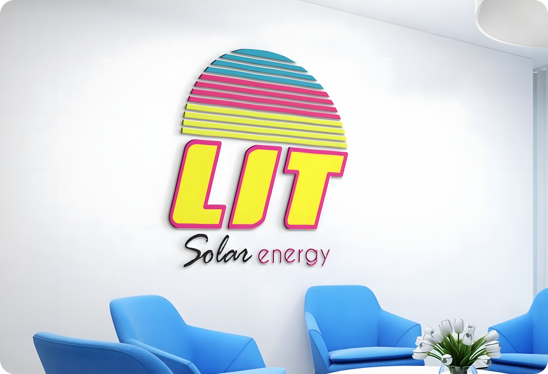
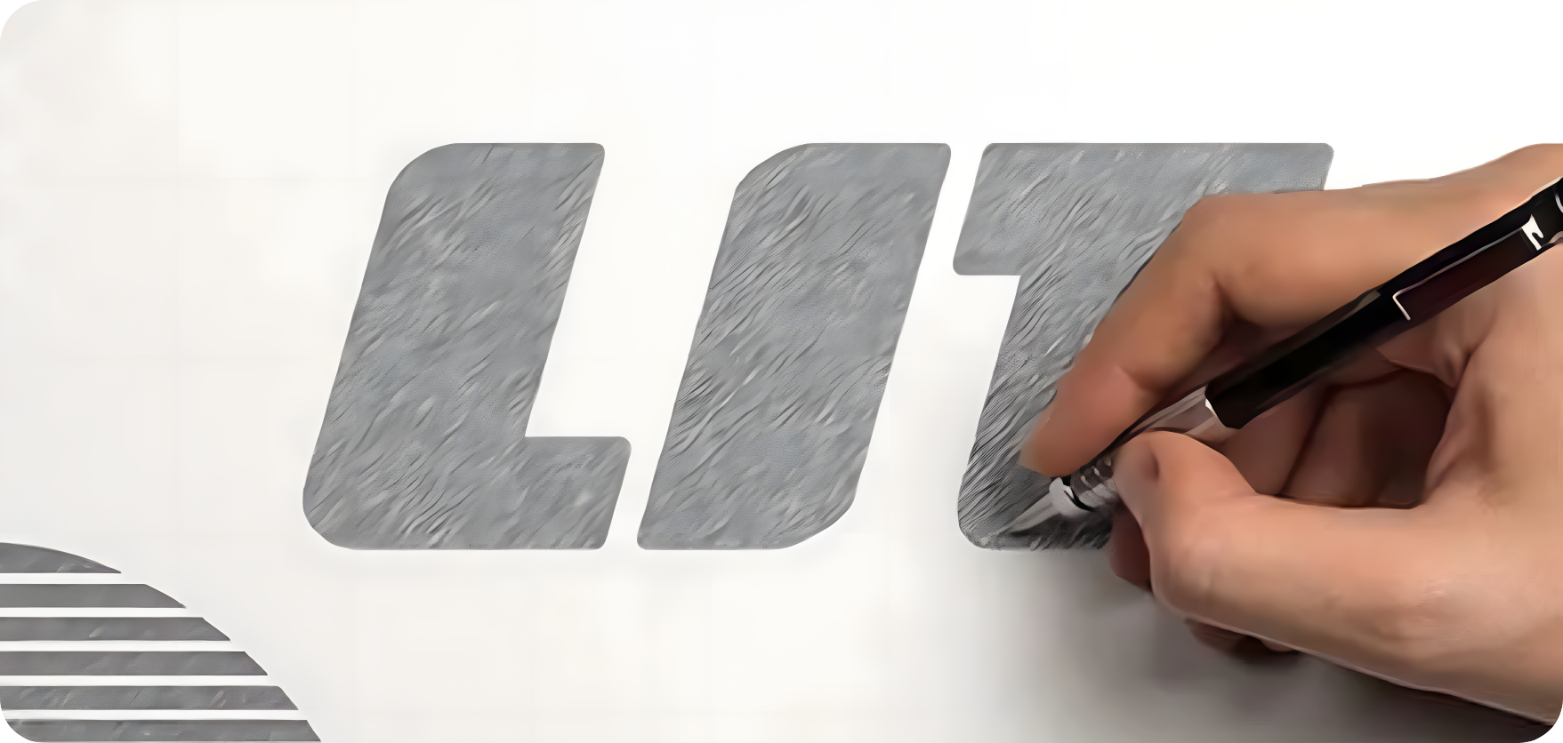
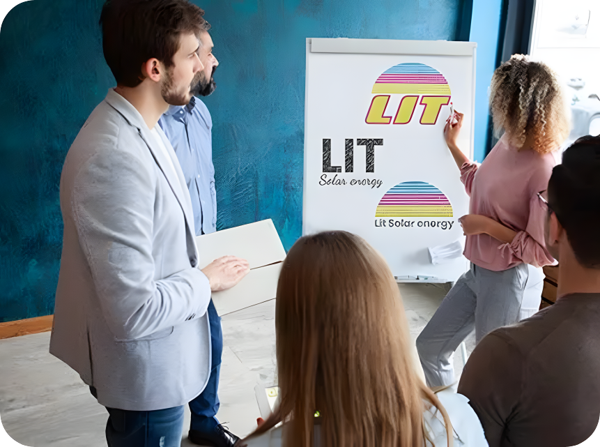
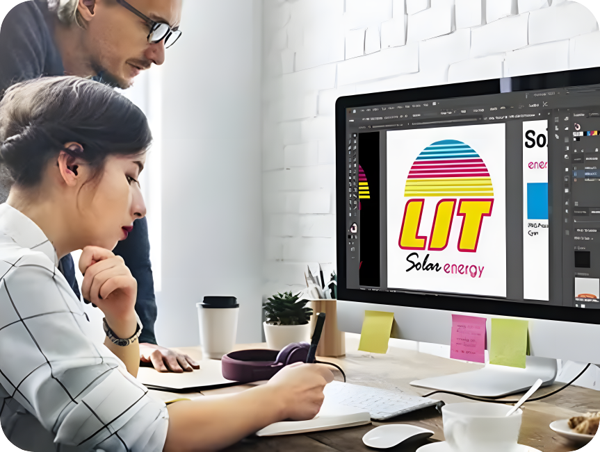
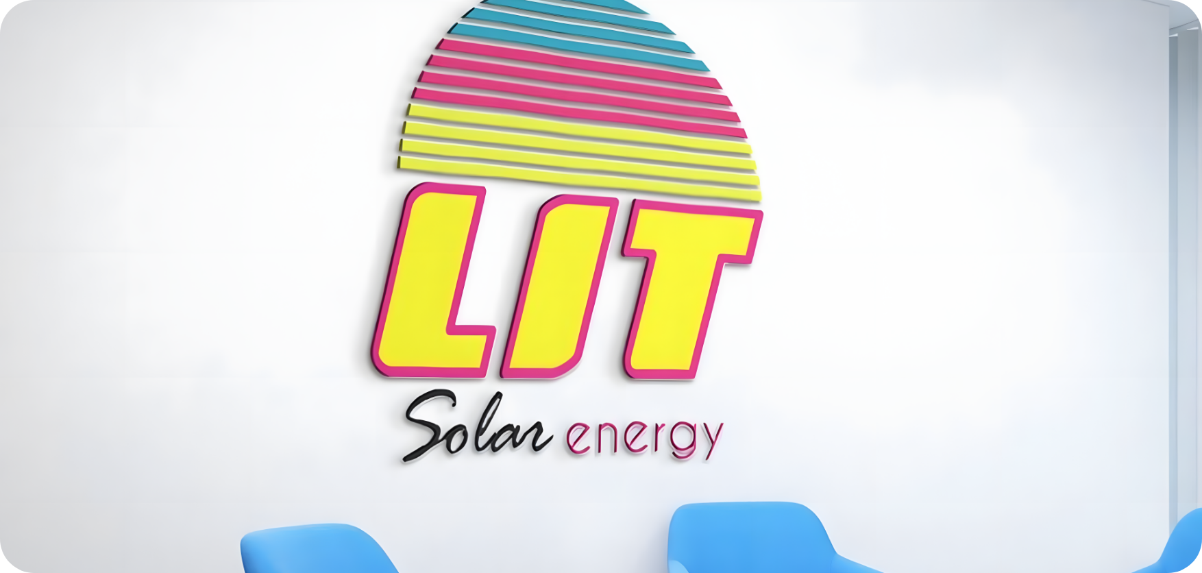
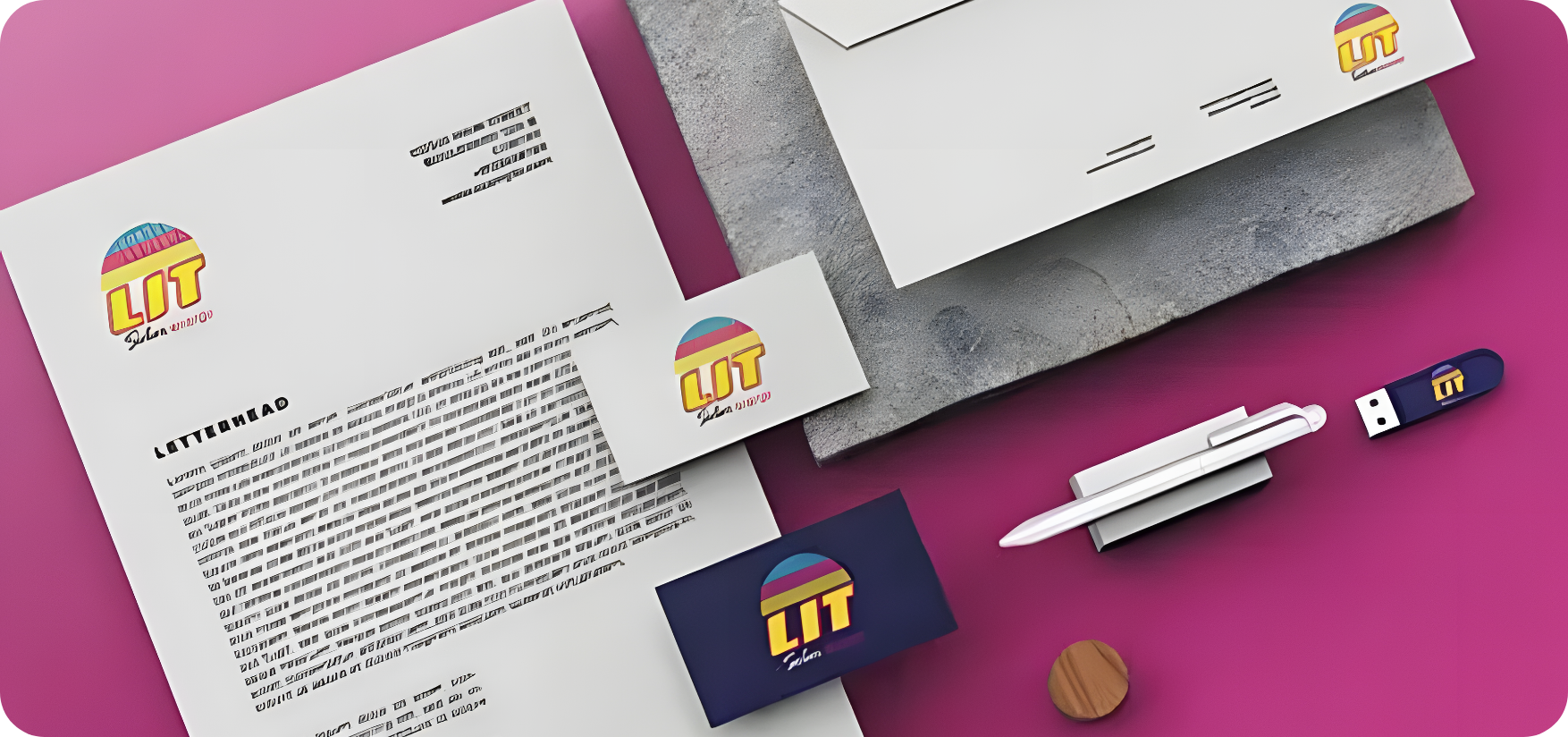
The bright, neon, half-circle imagery within the LIT logo is representative of, you guessed it, solar energy. We love it when we can incorporate concrete elements into a strong design for our clients. This allows leads to get a feel for exactly what services the client provides from a quick glance.
