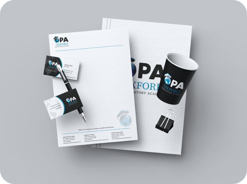


The design exploration phase involved the creation of visual elements that reflect OPA’s core values. Various design solutions were considered, focusing on
integrating symbols that epresent knowledge, inclusivity, and growth. Color schemes were selected to convey trust, intellect, and warmth, utilizing
palettes that were both vibrant and appropriate for an educational setting. Typography options were also explored to ensure readability and
professionalism, supporting the establishment of a cohesive and authoritative brand presence.


Execution of the branding guidelines included finalizing a flexible yet consistent visual identity system that could be applied across multiple mediums,
from digital platforms to physical materials. The approved designs were systematically applied to logos, stationery, marketing collateral, and digital assets, ensuring uniformity in OPA’s brand representation. Guidelines were documented comprehensively to facilitate ongoing use and adaptation by OPA staff, supporting the Academy’s communications with clear and consistent branding.
