Casey the Barber is a beard magician and, obviously, worthy of a wizard-worthy logo. So, when Casey turned to LightHouse Graphics for help, we knew we had our work cut out for us (see what we did there?).
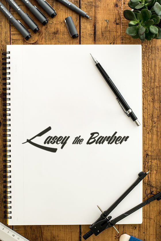
While it may be easy to imagine a straight razor as a “C,” it took some doing so it was equally recognizable as both. We added a heavy forward slanted, script font for a 50s throwback vibe–and to let patrons know they can get in and out in a hurry. We wanted the vintage vibe mixed with the efficiency of a modern-day cut.

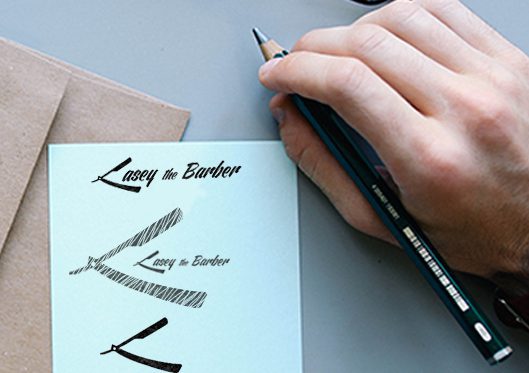


To come up with the logo design, we had to put ourselves behind the barber chair and think like Casey. What are the tools of the trade? What makes his business unique? How can we represent his brand with one simple icon? Then it hit us: a straight razor.
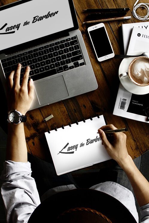

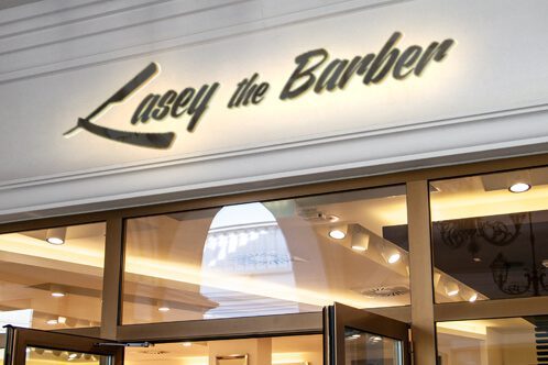
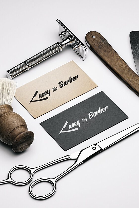
The end result was sharp and precise–you know, like Casey’s patrons’ beards. It clearly communicates who Casey is, whether it is applied to a storefront, a business card, or a website. Additionally, since the logo was sent over in Vector, this image is widely applicable across mediums!


To come up with the logo design, we had to put ourselves behind the barber chair and think like Casey. What are the tools of the trade? What makes his business unique? How can we represent his brand with one simple icon? Then it hit us: a straight razor.


While it may be easy to imagine a straight razor as a “C,” it took some doing so it was equally recognizable as both. We added a heavy forward slanted, script font for a 50s throwback vibe–and to let patrons know they can get in and out in a hurry. We wanted the vintage vibe mixed with the efficiency of a modern-day cut.


The end result was sharp and precise–you know, like Casey’s patrons’ beards. It clearly communicates who Casey is, whether it is applied to a storefront, a business card, or a website. Additionally, since the logo was sent over in Vector, this image is widely applicable across mediums!
Charleston, SC
Boston, MA
Phoenix, AZ
Lansing, MI
Franklin, TN