Sometimes retroelements come back to create the best possible design. See just what that looks like in our logo work for Lit Solar!
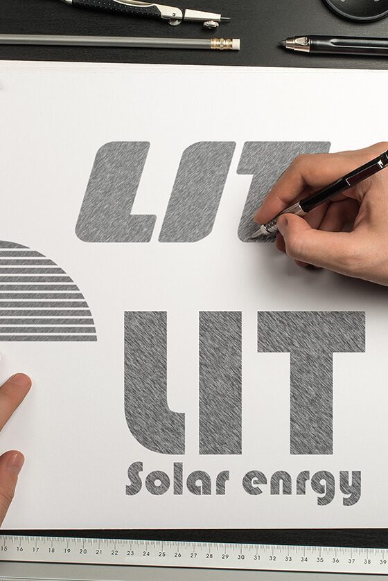
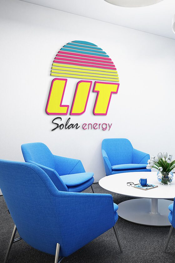
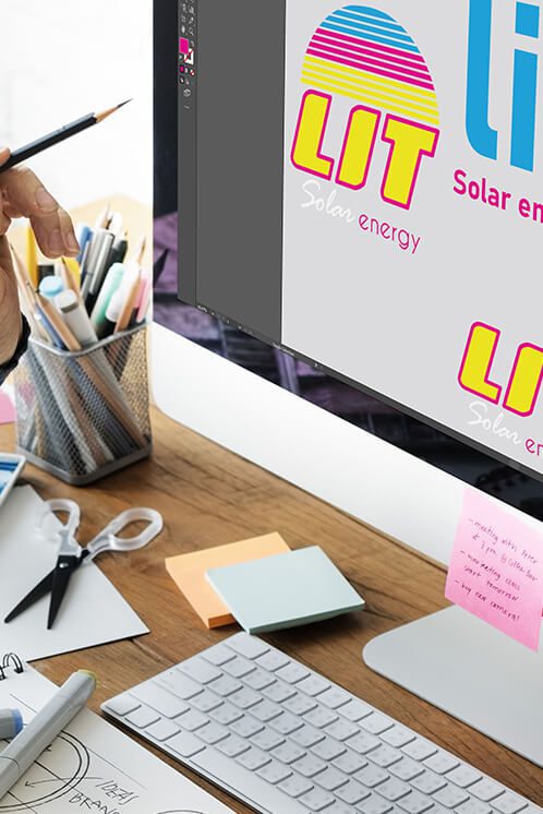
The bright, neon, half-circle imagery within the LIT logo is representative of, you guessed it, solar energy. We love it when we can incorporate concrete elements into a strong design for our clients. This allows leads to get a feel for exactly what services the client provides from a quick glance.
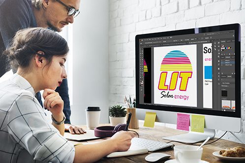

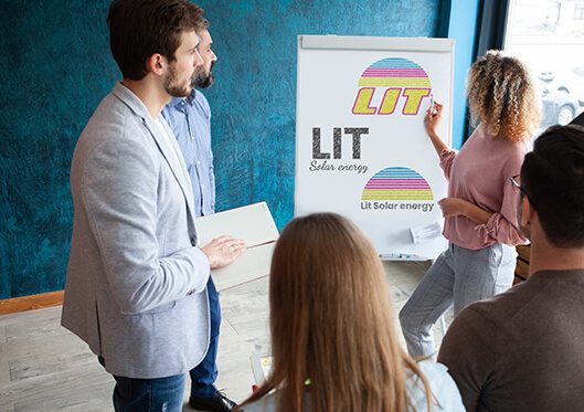


When LIT Solar came to us, they were looking for a refresh that would knock the lights out of the competition! By using retro colors and a sleek design, we were able to create something completely unique to this wonderful company.


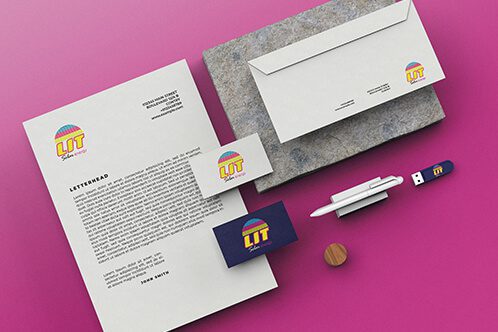
Ultimately, due to our in-house printing services, we are able to get business cards sent and shipped within mere days of client approval. This means that there is no need to find other folks to work with when you bring your business to LightHouse Graphics!


When LIT Solar came to us, they were looking for a refresh that would knock the lights out of the competition! By using retro colors and a sleek design, we were able to create something completely unique to this wonderful company.


The bright, neon, half-circle imagery within the LIT logo is representative of, you guessed it, solar energy. We love it when we can incorporate concrete elements into a strong design for our clients. This allows leads to get a feel for exactly what services the client provides from a quick glance.


Ultimately, due to our in-house printing services, we are able to get business cards sent and shipped within mere days of client approval. This means that there is no need to find other folks to work with when you bring your business to LightHouse Graphics!
Charleston, SC
Boston, MA
Phoenix, AZ
Lansing, MI
Franklin, TN