Is your company interested in a stoic logo design that conveys strength of service? Look at the logo we created for Prudent Financial Solutions!

As a business dedicated to working with clients who are in debt in order to quickly avail them of that debt, Prudent Financial needed a logo that would show off how willing they were to fight for those who trusted them with their business. That’s how the image of Poseidon was born–a strong, resilient character, who would never lose in a fight.

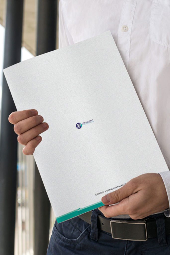


When Prudent Financial came to us, they were looking for a logo that would convey a silent type of strength to their clients. As a financial institution, it was important that every minute detail in their logo convey trustworthiness and strong character.
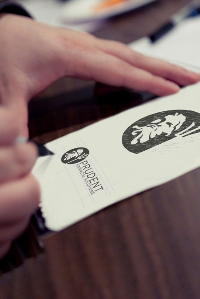

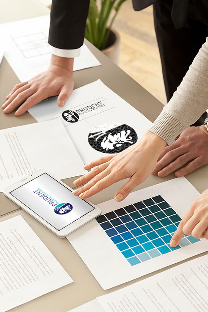

This logo uses a strong emphasis on blue with some color contrast to break up the imaging. Additionally, while the same font is used across the logo to promote consistency, the color change allows your eyes to move across the logo, and places the emphasis on just the write points.
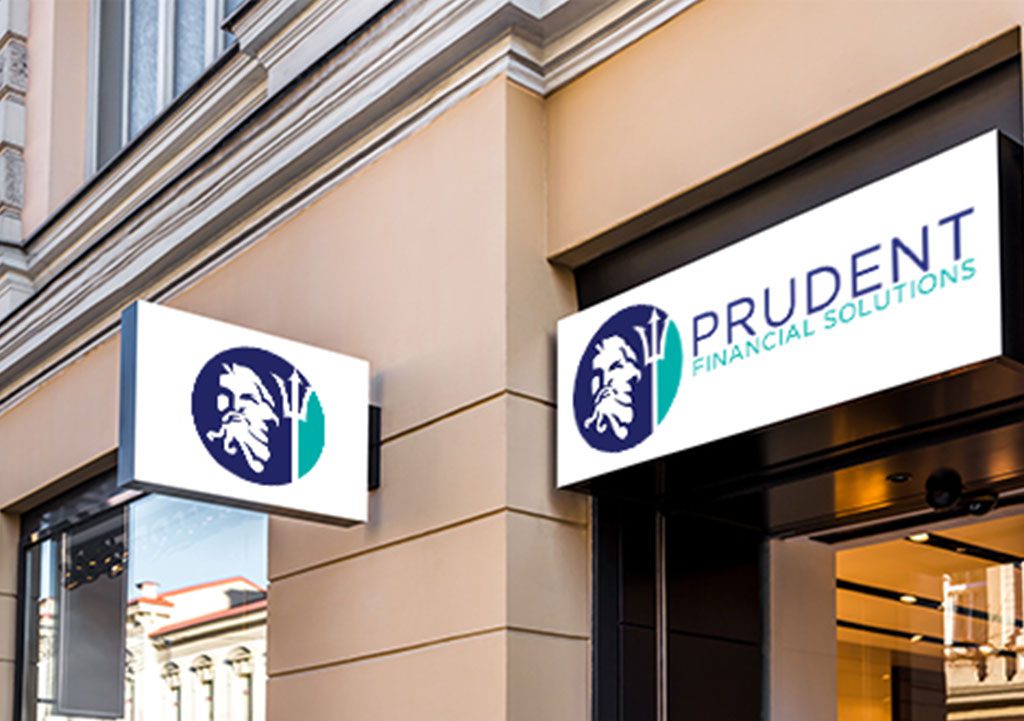


When Prudent Financial came to us, they were looking for a logo that would convey a silent type of strength to their clients. As a financial institution, it was important that every minute detail in their logo convey trustworthiness and strong character.


As a business dedicated to working with clients who are in debt in order to quickly avail them of that debt, Prudent Financial needed a logo that would show off how willing they were to fight for those who trusted them with their business. That’s how the image of Poseidon was born–a strong, resilient character, who would never lose in a fight.


This logo uses a strong emphasis on blue with some color contrast to break up the imaging. Additionally, while the same font is used across the logo to promote consistency, the color change allows your eyes to move across the logo, and places the emphasis on just the write points.
Charleston, SC
Boston, MA
Phoenix, AZ
Lansing, MI
Franklin, TN