
preloader
T3 Moto 1

T3 MOTO

Services

Graphic Design, Logo & Branding

PROBLEM STATEMENT

t3 Moto needed to define a distinct
brand identity that resonated with
their target market

T3 Moto 2

Conceptual Design

In developing t3 Moto’s branding, the conceptual design centered on creating a strong identity that reflected the company’s passion for dirt biking and its natural environment. The branding aimed to capture the rugged and adventurous spirit associated with dirt biking while emphasizing a connection to nature. Themes such as exploration, freedom, and environmental harmony formed the foundation of the brand’s conceptual identity.

Design Exploration

T3 Moto 3
T3 Moto 4
T3 Moto 5
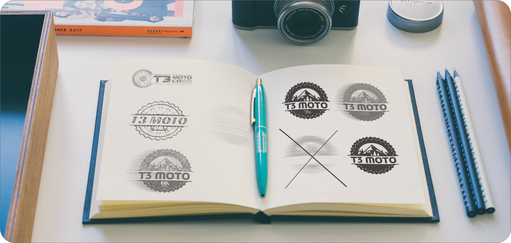
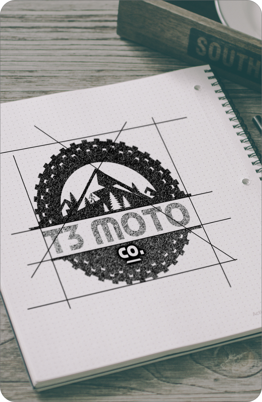
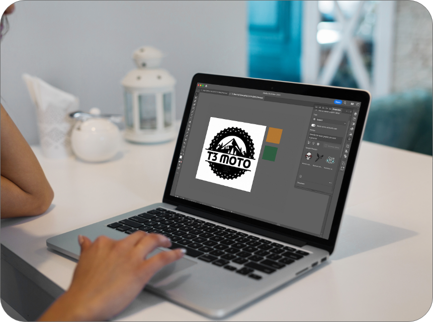
The design exploration phase prioritized the use of earthy tones and nature-inspired imagery. Various color palettes were considered to evoke the terrains commonly encountered in dirt biking, such as earthy browns, greens, and muted oranges. Imagery drew inspiration from landscapes, trails, and elements of the natural world, reflecting the adventurous lifestyle that t3 Moto promotes. Typography was chosen to be bold and dynamic, conveying the excitement and energy of dirt biking.

Execution

T3 Moto 6
T3 Moto 7
T3 Moto 8
T3 Moto 9
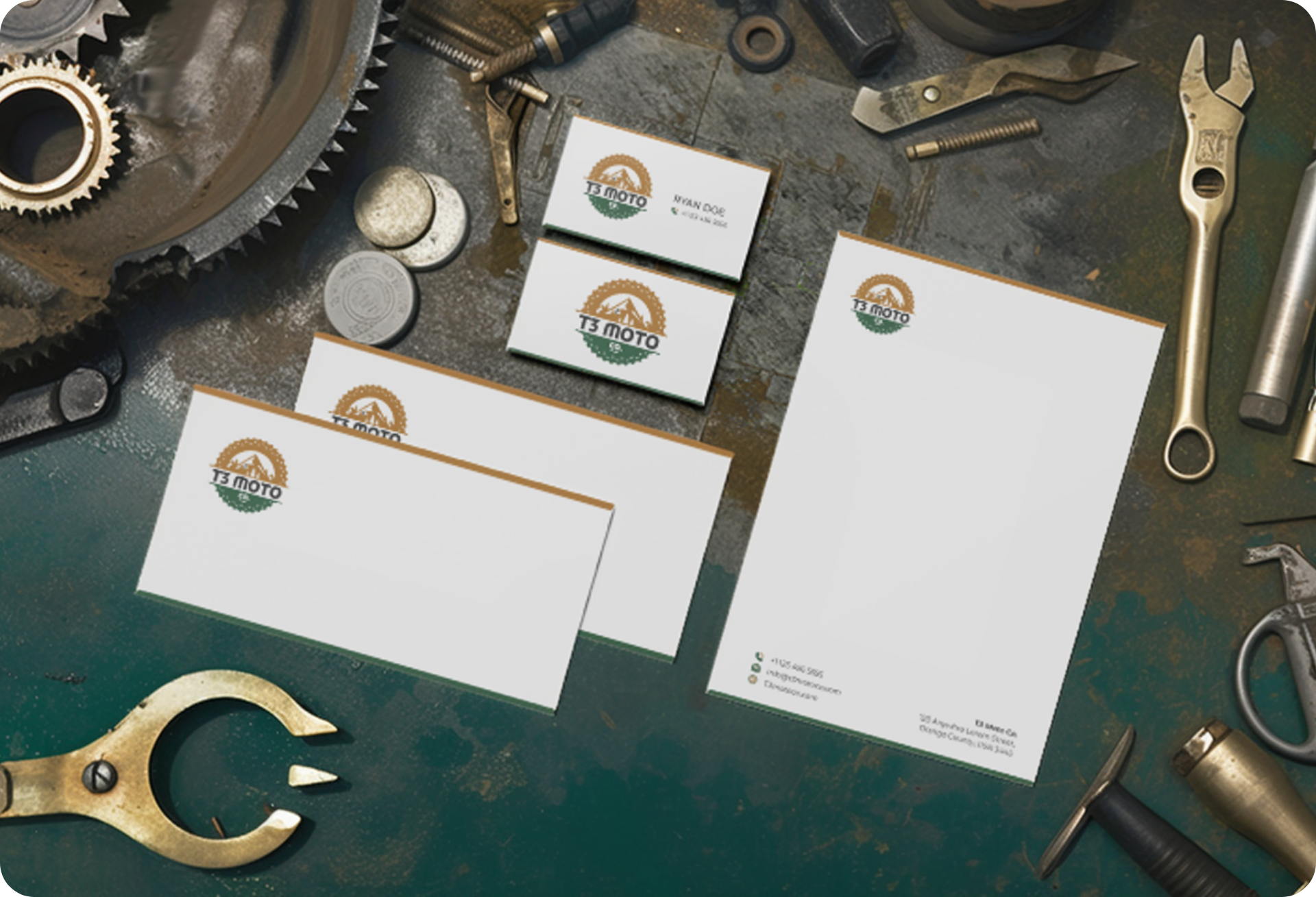
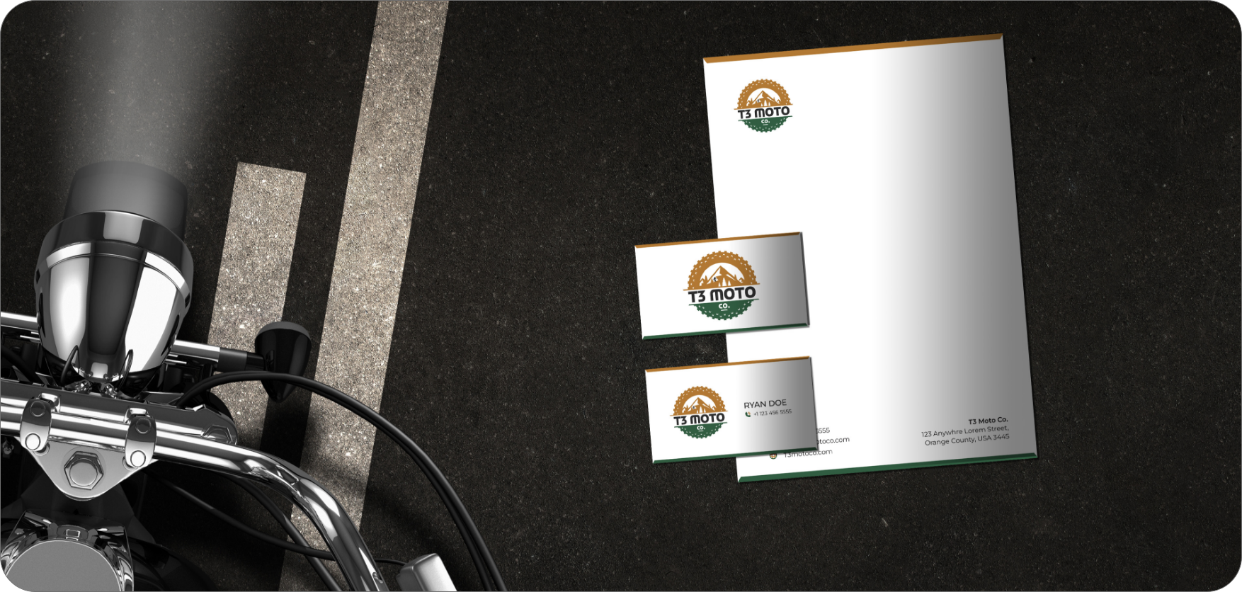
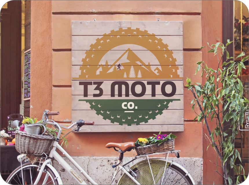
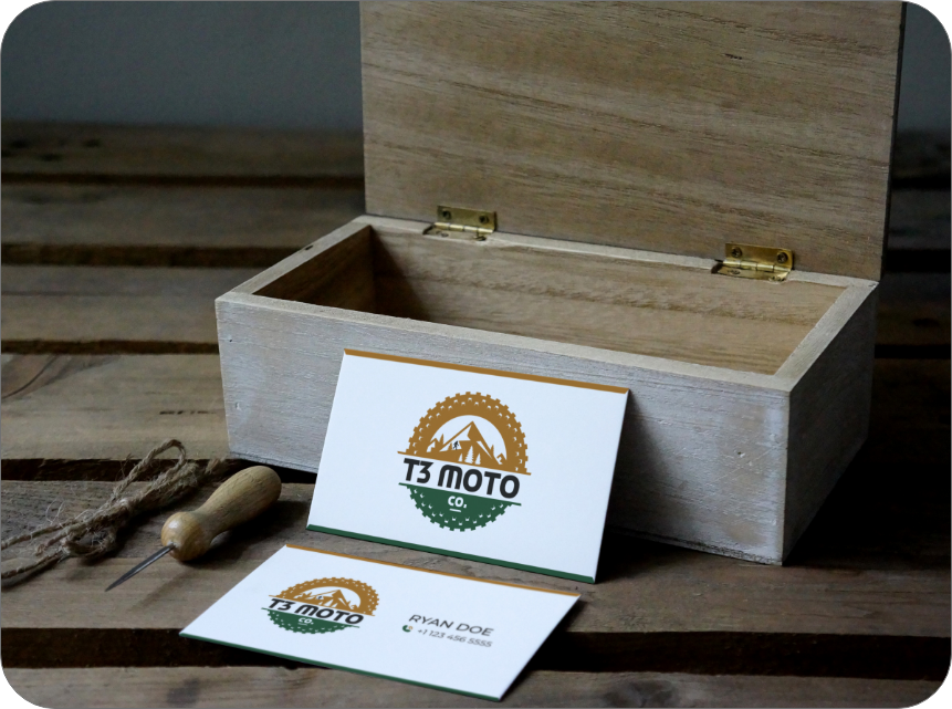
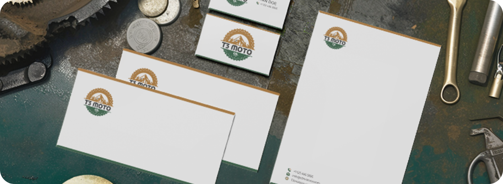
Execution involved applying the finalized branding elements consistently across all of t3 Moto’s touchpoints. This included logo design, product packaging, marketing materials, and digital presence. Each element was crafted to align with the earthy and natural aesthetic, ensuring a cohesive brand narrative. Comprehensive guidelines were provided to t3 Moto for maintaining brand consistency in future communications and marketing efforts.